I think we’ve all probably heard a few things about the eye shadow palettes from The Vault collection from Morphe x Jaclyn Hill. I had to get my hands on these to see what the hype, or hate, was about. I know these were repressed or reformulated from the original version or batch that came out, and I got the ones with the production code “V2” on the back of them. Apparently the “V2” is an indicator of when they were made, or what batch they’re part of. Some of the new palettes don’t have a “V-whatever” sticker on them at all, but are supposedly still part of the reformulated palettes. Upon first glance, all four palettes are stunning. I didn’t get to use them until after I photographed them, but once I started playing around with them, I definitely saw some inconsistencies. I also feel like these shadows are inconsistent from Morphe’s formula that’s in the 35 and 15 palette I’ve used, but since The Vault was developed and formulated with Jaclyn Hill, perhaps that’s why there are differences.
So far I’ve created four or fives looks with the Bling Boss palette, using anywhere from 3 to 5 shadows each time so I could try them all out. Half of this palette worked for me although it took a little finessing, and the other half was, to put it nicely, a frustrating, patchy disaster. Most of the looks that I’ve done have not turned out well at all. It took forever to build up color and make some of the shadows show up, some shadows really stuck to certain areas and didn’t want to blend out, and some shadows were mostly sparkly bits and had no real base color, causing quite a bit of fallout. I didn’t even post most of the looks I’ve done because it was honestly not a fun experience playing with this palette and it left me feeling pretty disappointed. In my opinion, this palette is probably not suitable for people just getting into makeup, who aren’t used to having to try 39,875 different application techniques to get a shadow to show up or blend out. I’ve been doing makeup professionally for almost 15 years, I’ve used a ton of products from a ton of brands, and I STILL got incredibly fed up trying to make use of these shadows, so that should tell you something!
One of the looks I did with this palette was actually gorgeous and I’m sad I didn’t get better photos of it. The more reddish shadows in the Bling Boss palette seemed to perform slightly better than the purples did, but not by much. A few wanted to stick or were difficult to blend out, but for the most part, the reddish shades almost made this palette worth the $15, but not quite. I’ll get into more detail about every shadow in this palette in the summaries/rundowns below, so keep reading!
I know this is the part where I usually talk about the formula of a product or palette, but there’s so much variation in this palette, I’m just going to talk about that stuff in each individual shadow summary.
I will say that if you just want some shadows to play around with and you aren’t looking for some epic, ride or die eye shadow palette, it’s worth the money, especially if you buy it in the vault set. If you don’t have the money to blow on this, don’t buy it. There are other similar shadows and palettes that you can find from other brands that would perform better, be overall more usable, and actually be worth your money. All that said, perhaps my version or batch sucks. Maybe some of these shadows are higher quality in other versions of The Vault. If you have a different, or even a similar experience with these shadows, let me know in the comments below! I’d love to know which version or batch all of you have, and how it worked out for you.
Bee Tee Dubs: If you want to keep up with me on Instagram, Twitter, or Snapchat, my name is lesley_makeup on all three platforms. I love hearing from you guys and I always use those platforms to post updates about when I’m making blog posts and what I’m testing out or loving!
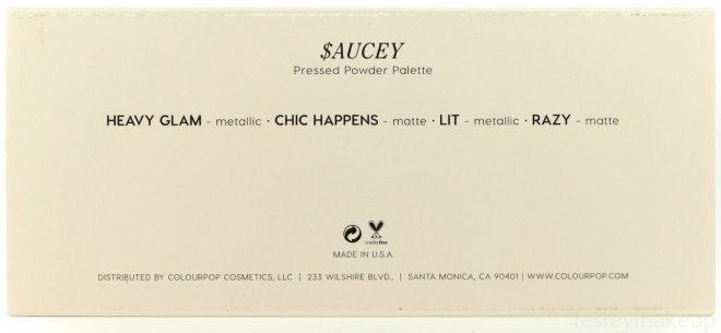
The Bling Boss Palette, along with the other three palettes in The Vault collection can be purchased from Morphe or Ulta, either online or in stores. Individually, the palettes cost $15, or you can buy all four of them as a set for $49. I actually don’t see them available from Ulta’s website as a set, but perhaps it’s available in stores? I’m not sure. Anyway, each palettes contains ten 1″ pan shadows weighing in at 1.6 g / 0.056 oz of product each. That’s a total of 16 g / 0.56 oz of shadow for the whole palette. If you divided up the price, it comes out to be $1.50 per shadow, which is a steal, and which is why I didn’t really expect miracles from these palettes.
If you compare this palette to something like palettes from Anastasia Beverly Hills, you’re getting four less shadows but the shadows in Bling Boss are bigger, and it’s a better deal (ABH palettes will run you $42). In comparison to something like the Shayla x Colourpop Perception Palette, Perception contains six more shadows than Bling Boss does, weighs in with the exact same amount of product, and costs $23 ($8 more than Bling Boss, but only costs you $1.44 per shadow). Now for individual comparisons, Anastasia Beverly Hills shadows are 0.07 g larger the shadows in the Bling Boss palette, but they cost $12 each. MAC Eye Shadows in refill pan form are 1.6 g smaller than the shadows in the Bling Boss palette and cost $7. Colourpop’s individual, pan-only shadows are even cheaper at $4 each, and contain 1.5 g of product.
Basically, pretty much everything costs more than this palette if you break it all down. However, I think that in this case, you get what you pay for. Yeah, you get a lot of variation in The Vault palettes, but are you only getting the quality in about a quarter of the shadows in the Bling Boss palette. Maybe the other palettes are better or different… I haven’t tried them out yet, but I’m going to over the next few weeks, and I’ll be reviewing those as well!
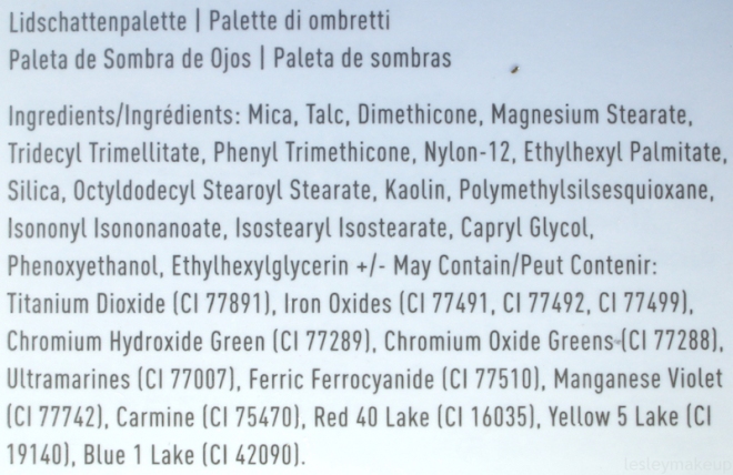
Morphe is a cruelty-free company, so that’s a plus! Each palette may not be vegan, though. Carmine is on the ingredients list under “may contain”, so I can’t tell you which shadows are and are not vegan. Since Carmine is a red dye, it’s more than likely in most of the shadows in this palette.
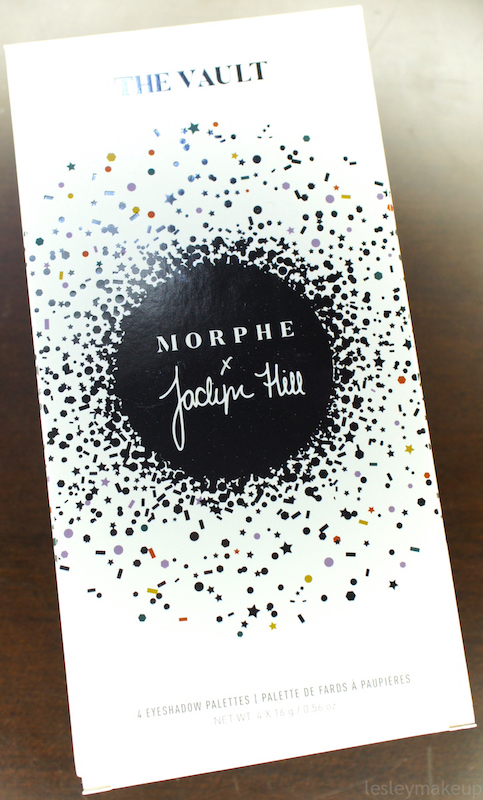
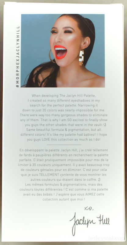
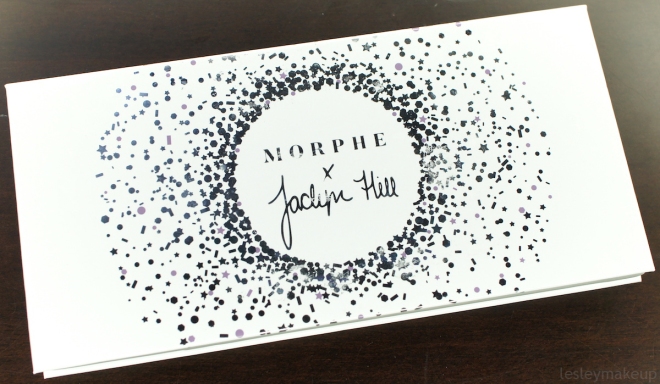
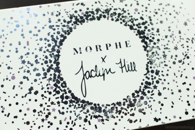
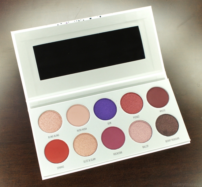
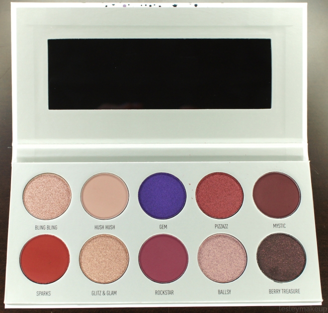
The packaging for The Vault and for this palette is cute. It’s pretty clean, it’s classy, it’s very “Jaclyn”, and I like it! The box that The Vault set comes in has the Morphe x Jaclyn Hill logo on it and features the four colors for each palette mixed together with the metallic silver in the little burst logo. The box also has a little bit about how this collection came to be and a photo of Jaclyn on the back, and the ingredients listed on……….. As for the set itself, it’s held in another box which is open on one side so you can see the palette labels. It’s really neat and has a ribbon inside of it that you pull on to slide the palettes out, making it easy to grab them without messing up your nails or desperately trying to pry them out of there. The Bling Boss palette features the typical Jaclyn Hill silver burst logo with little purple confetti mixed in, representing the color theme of the shadows inside. Oh and one more thing… There’s a mirror in each of The Vault palettes! It’s a good quality mirror too and not one of those cheap, plastic types that distorts your pretty face, so that’s a positive thing about this palette!
Note: Some photos below have been edited to represent the shadow color as accurately as possible.
All reviews are based on how these shadows perform when applied and tested over a primer, just like how I always wear every other eye shadow. My primer of choice is MAC’s Soft Ochre Pro Longwear Paint Pot, set with whatever powder I use on my face (usually Laura Mercier Translucent or MAC Mineralize Skinfinish Natural).
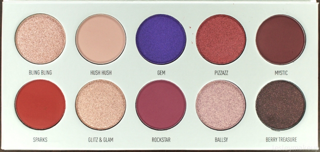
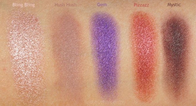
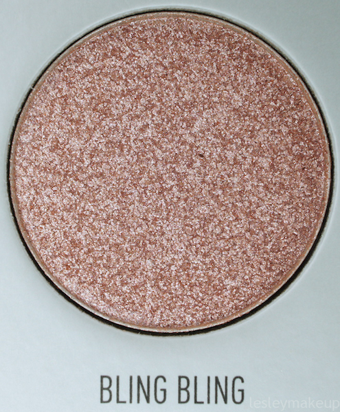
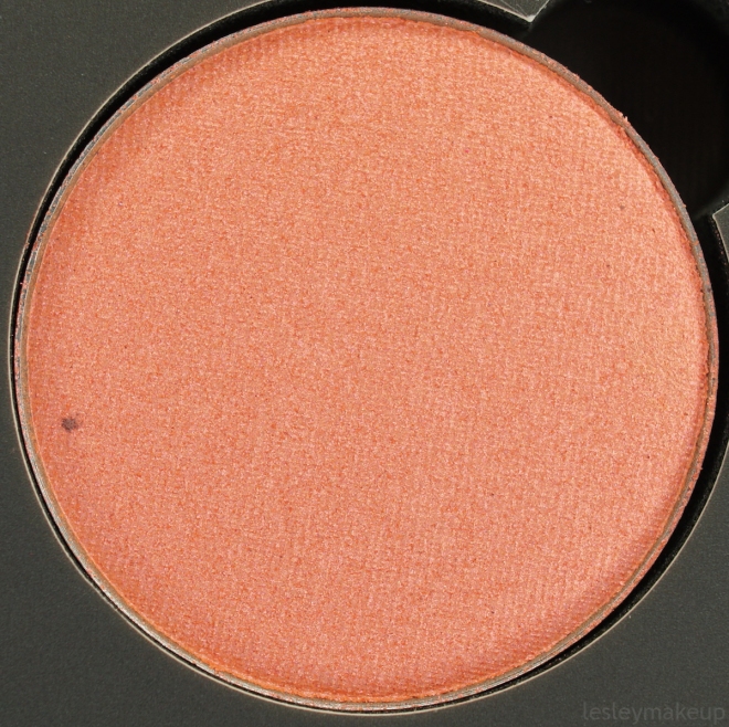
Bling Bling: Morphe describes this shadow as a “silvery pink glitz”. I’m not positive what a “glitz” is, but it’s more glittery than it is colorful, so maybe that’s what they mean. It’s a light, mostly neutral, nude-pink with champagne-silver sparkly bits. This shadow swatches beautifully, but to get it to apply to the lid or inner corner the same way it looks when it’s swatched, you really need to use your finger. I tried both a dry and damp brush with Bling Bling and it ended up having very little color and only showed the shimmer. I feel like this is best used as an inner corner or lid color, or even applied over other colors to add some glitter and shine.
The formula for this shadow was okay. It feels buttery and smooth when applied with a finger, like when I swatched it, but it also felt a little dry but when I applied it with a brush. Color payoff was lacking when applied dry, but was decent using my finger. Same with coverage… It’s nearly fully opaque when swiped onto the lid with a finger, but it’s quite sheer when applied with a brush. I got some fallout of the shimmery particles, but it wasn’t anything I couldn’t dust away with my powder brush. Wear time was also just okay. I wore Bling Bling partly on my lid and also on my inner corner but noticed movement and fading by about hour 3 to 4.
Dupes:
- MAC’s All That Glitters Eye Shadow is almost the exact same color as Bling Bling, but contains less true sparkle and has more of a satiny sheen. It is, however, MUCH easier to work with and more pigmented.
- MAC’s Honesty Eye Shadow is also very similar and contains some sparkle, but is slightly darker and more peachy.
- ABH’s Rose Eye Shadow has a similar finish and is very close in color, but is a little more pinky-toned.
Overall Rating: 2 / 5
Application: 1
Coverage: 1
Color Payoff: 1
Texture: 2
Wear Time: 2
Packaging: 5
Value: 2
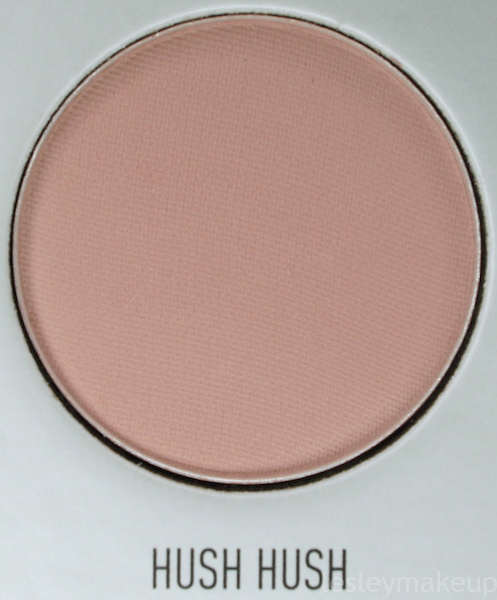
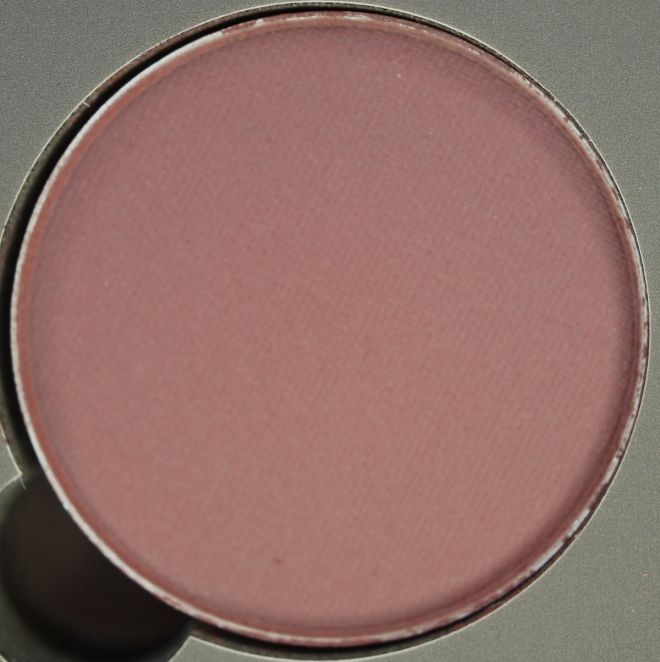
Hush Hush: Hush Hush is a “matte lilac mauve” which has a true matte finish. It’s a light, cool toned, beige-mauve that looks darker and more mauve in person than in most photos. The swatch photo is the best representation of the actual color. I’m pretty fair, and on me, this applied even more cool toned than it looks in the pan. It’s a good crease/transition color and works well with the other shadows in this palette, but I actually wish it wasn’t quite so cool. This shadow takes a lot of building, but it wasn’t patchy.
The formula for Hush Hush is decent… It’s weird because swatching it, it feels very smooth and almost creamy, but applying it with a brush makes it seem considerably more dry. Like I said, it takes some layering to really show up, but it serves its purpose to diffuse other shadows and makes edges look more blown out and less harsh. Color payoff is alright, but nothing super impressive with just a few swipes. You’ll probably have to dip your brush into the pan a few times and build it up. Coverage is also just alright. It’s not patchy or straight up bad, but not super pigmented or opaque either. I’m not going to hate on this shadow for that, though, since I really only see this being used for transition/blending purposes. I didn’t notice any fallout with this shadow, and even if there was any, it’s so neutral I don’t see that being an issue. Wear time was really good and I didn’t notice any fading in or above my crease until hour 8 or 9.
Dupes:
- MAC’s Haux Eye Shadow is darker than Hush Hush, but aside from the depth, the color is incredibly similar, plus it’s MUCH more pigmented and applies more evenly than Hush Hush does.
- MAC’s Quarry Eye Shadow is slightly darker but very similar and more pigmented.
- MAC’s Malt Eye Shadow is lighter, but not by much, and is very close in color. It looks a lot lighter in the pan, but on the skin, they’re close. Malt would be a nice substitute if you didn’t want something quite as cool toned as Hush Hush.
Overall Rating: 3.2 / 5
Application: 2
Coverage: 2
Color Payoff: 2
Texture: 3
Wear Time: 5
Packaging: 5
Value: 4
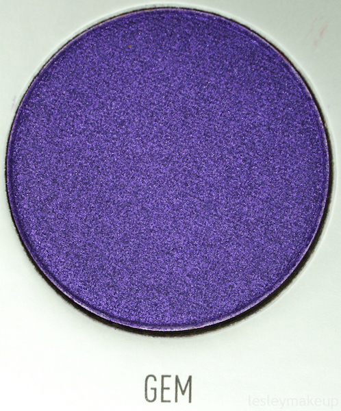
Gem: Gem is described as a “vibrant violet sheen” and has a satiny, nearly frosted finish. It’s a medium, cool toned purple with some serious sheen that contains some violet and pinky reflects. This color applied really nicely to my lid with a brush, either dry or damp, and with a finger. I also used it along the lower lash line with a pencil brush for a pop of color and it applied easily in that area too. This is by far the brightest color in this palette and also one of the few shadows that performs well.
The texture of Gem felt very smooth. It’s perhaps a little dry, but that didn’t seem to cause any problems with the application. Color payoff is really nice and it looks about the same on the lid as it does in the pan or when swatched. Coverage was also great and Gem was fully opaque using little product. I didn’t have any fallout with this shadow and wear time was impressive as well. I didn’t notice any fading when I wore this on the lid until about hour 6 or 7.
Dupes:
- MAC’s Parfait Amour is lighter and much more blue toned.
- Anastasia Beverly Hills’ Iridescent Purple Eye Shadow is lighter and more blue-purple, less violet.
- ABH’s Enchanted is darker and is also more of a blue-based purple than Gem is.
Overall Rating: 4.4 / 5
Application: 5
Coverage: 5
Color Payoff: 5
Texture: 4
Wear Time: 4
Packaging: 5
Value: 5
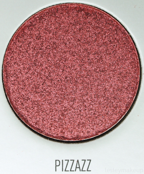
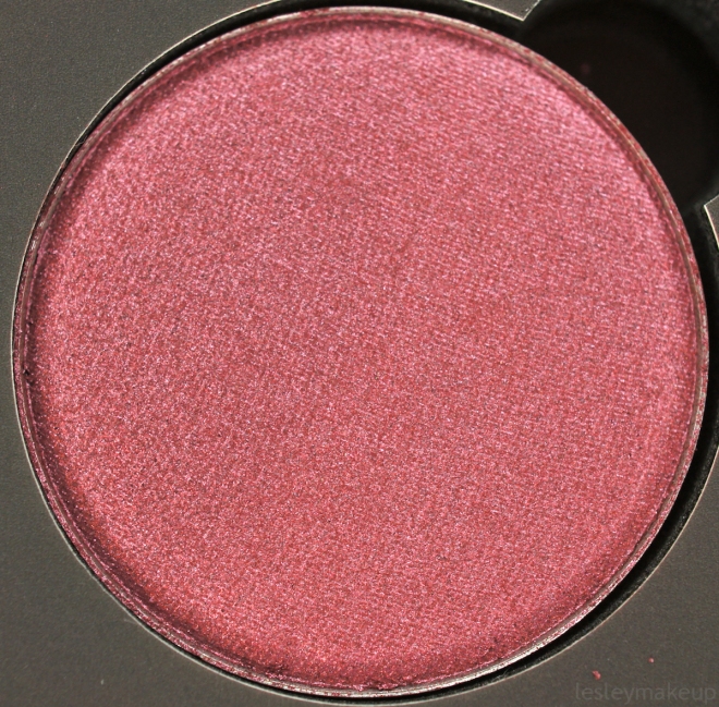
Pizzazz: This shadow is a “glistening magenta” and has a somewhat frosted finish. It’s a medium, warm toned magenta-ish color with cranberry hues to it. This is a great color on the lid or around the inner and outer corner for a halo eye. The formula is very similar to Gem, and this is one of the nicer shadows in the Bling Boss palette.
Pizzazz’s texture felt nice when I swatched and applied it, but it can be a little patchy and sheer. I find that this shadow applies best with a finger or a damp brush. You can get a good application with a dry brush, too, but I recommend doing some layering with a flat, dense brush to get the best pigmentation and coverage. Color payoff looks just like it does in the pan if you pack it on. Coverage is, like I said, patchy at times, so you only get full opacity with this shadow with a finger or layered application. Pizzazz stuck to the brush and lid well and didn’t give me any fallout. Wear time is good too, and there was very little fallout! I didn’t see any fading occur until I had worn this on the lid for about 7 hours.
Dupes:
- MAC’s Ruddy Eye Shadow is more of a true red, but has the same finish and actually has more pigmentation.
- MAC’s Cranberry Eye Shadow is darker and has more purple tones.
Overall Rating: 4 / 5
Application: 3
Coverage: 4
Color Payoff: 4
Texture: 4
Wear Time: 4
Packaging: 5
Value: 4
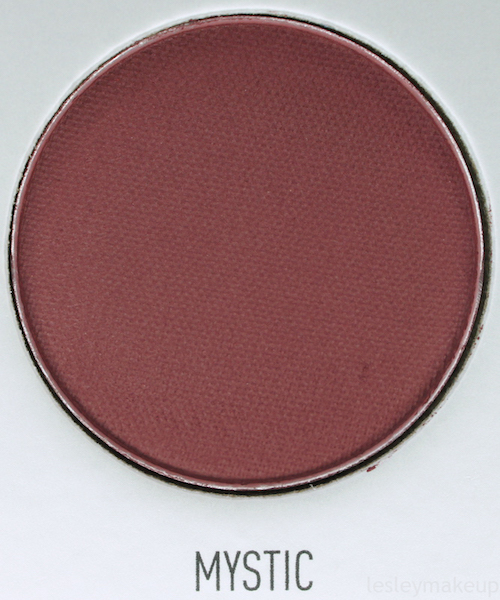
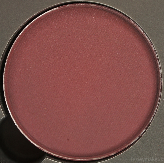
Mystic: Mystic is described as a “matte blackberry” and has a completely matte finish. It is a dark, warm toned blackberry, so it has burgundy, plum, and rich brown undertones to it. I’ve tried this shadow both on the lid for a smoky look and in the crease, and I was not impressed with either application method. It took forever to pack on enough shadow onto my lid with a flat, dense brush to get an even, opaque application for a smoky look, and even then, this shadow just looked dry and blah. In the crease, I had similar issues… Using a fluffy brush like a MAC 224 was pointless and I could barely get this shadow to show up. Using something smaller and slightly more dense, like a MAC 217, worked out a little better, but then I had problems with Mystic sticking in some areas more than others, not showing up much unless I went over it a thousand times, or just not blending out very well, making it look patchy.
The texture of Mystic feels smooth, but also feels quite dry. The pigmentation is there, but the formula just does not make it possible for it to apply as boldly or evenly as I’d like it to. I really had to do some finessing to make this shadow work for me, which sucks. Color payoff is alright if you pack it on, but that’s the only way you’re going to have this shadow appear even close to the color it is in the pan. Coverage is subpar as well, and is fully opaque only when layered a lot. On the plus side, I didn’t notice any issues with fallout. Wear time was okay, but I did have some patchy fading in the crease by about hour 4 to 5, and it began to fade on my lid by hour 5 or 6.
Dupes:
- MAC’s I’m Into It Eye Shadow is has more brown than plum undertones, but it’s similar.
- MAC’s Sketch Eye Shadow is darker, more purple and also contains a hint of shimmer in a matte base.
- MAC’s Deep Damson is nearly the same color (perhaps more reddish), is also matte, and is much more pigmented.
Overall Rating: 2.4 / 5
Application: 1
Coverage: 2
Color Payoff: 2
Texture: 2
Wear Time: 3
Packaging: 5
Value: 2
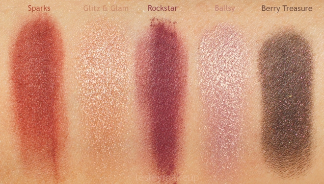
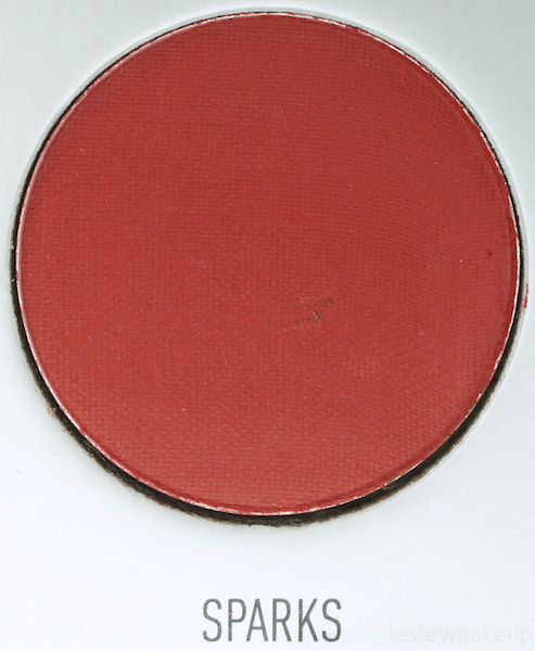
Sparks: Sparks is a “matte ruby red” with a true matte finish. It’s a medium-dark, warm toned red, but it’s not too crazy intense and seems to have both blue and brown undertones, making this color usable with many different looks. I only used this in my crease/outer v and smudged under the lower lash line, but it did the job. It can be a little patchy, but this is one of those colors that’s probably best applied in layers so it doesn’t become too bold, too quickly, as reds can do at times.
The texture for Sparks is alright… It feels almost buttery, but it still has a bit of dryness to it that I’m not a big fan of. Color payoff is decent, but it did take some layering to make it show up true to pan color. Coverage is the same way… It takes some layering, but less layering to reach full opacity than a lot of other matte shadows in this palette. I noticed a little fallout with Sparks, but since it’s so dry, it’s easy to wipe away with your powder brush and doesn’t really stick to the skin. Wear time was fantastic and this shadow lasted well over 8 hours in my crease and along my lower lash line before I saw any fading occur.
Dupes:
- Fetish Eye Shadow from Jeffree Star’s Androgyny palette is the closest dupe I found for Sparks. It’s very similar, maybe a little more brownish-toned, but it’s incredibly pigmented, especially compared to Sparks.
Overall Rating: 3.7 / 5
Application: 3
Coverage: 3
Color Payoff: 3
Texture: 3
Wear Time: 5
Packaging: 5
Value: 4
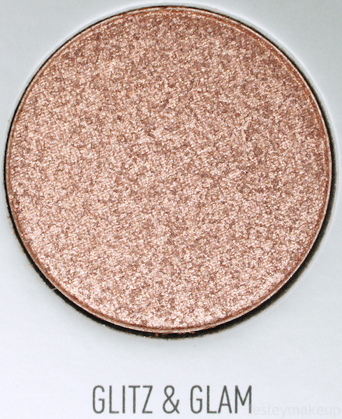
Glitz & Glam: This eye shadow is a “shimmering rose gold” with a sparkly, frosted finish. It’s a light, warm toned, champagne rose gold that’s perfect for the lid or inner corner. It applied a lot better than Bling Bling did, although like Bling Bling, it definitely looks better when applied with a finger, a damp brush, or with a smooth, flat, synthetic brush (I used what’s supposed to be a small concealer brush).
The texture and formula for Glitz & Glam is nice and smooth, so it applies pretty well. Like I said, finger application seems to work best if you want this shadow to show up. Color payoff is good too, but it somehow looks more peachy on the eye or when swatched than it does in the pan. Coverage is mostly opaque with one swipe when using a finger to apply this shadow, but you have to layer it and pack it on to get full opacity when using brush. Like the other shimmery shadows in this palette, there’s minimal fallout when applying it with a brush, but it’s easy to dust away. Wear time was great and this stayed in place on my lid with no fading for between 6 and 7 hours.
Dupes:
- ABH’s Glisten is incredibly similar, but very slightly darker and more peachy-pink.
Overall Rating: 4 / 5
Application: 3
Coverage: 4
Color Payoff: 4
Texture: 4
Wear Time: 4
Packaging: 5
Value: 4
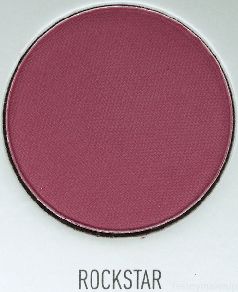
Rockstar: Rockstar is a “matte mulberry” with a totally matte finish. It’s a medium-dark to dark, cool toned, berry-magenta of sorts. Form what I understand, this color is significantly different in this and the other new palettes than it was in the original one. This was one of the shadows in the Bling Boss palette that swatched nicely but was difficult to work with. Like Mystic, I had some problems with Rockstar sticking to some areas and not wanting to blend out well, resulting in a patchy, frustrating mess.
This shadow feels smooth, but dry, just like the other mattes in this palette. Color payoff was okay, but it took a lot of layering to get it to show up the same way it looks in the pan. Coverage was just… It was bad. It also took a ton of layering and packing this shadow on to get anything close to full opacity, and even then it was super patchy. Because this shadow is so dry, it has some fallout, but not a ton. Wear time was the only redeeming quality with Rockstar, and it wore well in the crease for close to 8 hours.
Dupes:
- I didn’t really find any dupes for this. Maybe there’s one hiding in a palette somewhere… If I find one, I’ll be sure to post it, and if you know of one, leave it in the comments!
Overall Rating: 2.1 / 5
Application: 1
Coverage: 1
Color Payoff: 1
Texture: 2
Wear Time: 4
Packaging: 5
Value: 1
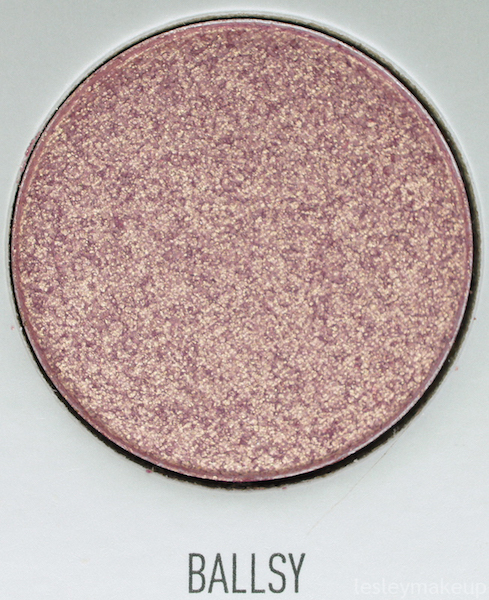
Ballsy: This eye shadow is considered to be a “glistening mauve pink” and has a satiny, frosted type of finish. It’s a light, pretty neutral toned, frosty champagne mauve. This performed slightly better than Bling Bling did and is very similar to Glitz & Glam as far as formula goes. It’s also pretty close in color. Ballsy a little more warm toned than Glitz & Glam is, but I think they’re pretty interchangeable. This shadow is a nice inner corner or lid color, but like the other shimmery shadows in this palette, it seems to apply best with a finger, dampened brush, or a dense, flat synthetic brush.
The texture of Ballsy feels smooth and creamy, just like most of the other shimmery shadows in the Bling Boss palette. Color payoff is okay at best. Once it’s applied, it’s lighter, warmer, and less pigmented than it looks in the pan. Coverage was so-so and took a finger application or layering to show up and give any degree of opacity. With a brush, I had some fallout, but didn’t notice any when I applied this with my finger. Wear time was good, and this stayed on my lid and inner corner for about 7 hours before I noticed any creasing or fading.
Dupes:
- ABH’s Glisten is super close, but a little more warm toned.
Overall Rating: 3.1 / 5
Application: 2
Coverage: 3
Color Payoff: 2
Texture: 3
Wear Time: 4
Packaging: 5
Value: 3
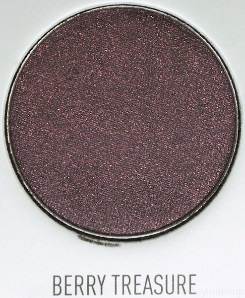
Berry Treasure: Berry Treasure is a “glittering charcoal black” with a matte base containing multicolored shimmery particles. It’s a dark, mostly cool toned, blackened plum with maroon and violet shimmery bits. For me, this color worked alright when seriously packed onto the lid for a smoky eye, or in the crease to deepen other shadows, but when it’s applied in the crease, the color and shimmer don’t really show up and it just looks like any other black matte shadow.
The texture of this shadow was okay, but it’s very dry even though it’s smooth. Color payoff takes a lot of layering to appear the same as it does in the pan, but you can get there. It also helps to apply this over a black base, like a cream eye liner. Coverage was complete dookie when applied with a brush, unless I took my time and packed it on layer after layer. Applying this shadow damp doesn’t seem to help, nor does a finger application. Despite that fact that not much shadow goes on, there’s still some fallout. Wear time was alright on the lid and it lasted for about 5 hours before I saw any creasing or fading. In the crease, this shadow wore well for just short of 7 hours.
Dupes:
- MAC’s Beauty Marked Eye Shadow is nearly identical. The only difference is that Berry Treasure has more sparkle to it, but if you build up Beauty Marked, it has just as much glittery bits as Berry Treasure does.
- ABH’s Aubergine Eye Shadow is much more of a warm toned purple and has a frosty sheen rather than a matte base with sparkle like Berry Treasure does.
Overall Rating: 2.1 / 5
Application: 1
Coverage: 1
Color Payoff: 1
Texture: 2
Wear Time: 4
Packaging: 5
Value: 1
This post expresses my own honest opinion. I purchased this product with my own money and did not receive any type of PR or compensation for this review.